Sign up for trending news and first dibs
Google’s New Logo Looks Better, Loads Faster and Reads Easier
Google’s New Logo Looks Better, Loads Faster and Reads Easier
Google’s new logo is more than a cosmetic upgrade, it’s also about better user experience. How so? Read on to find out.

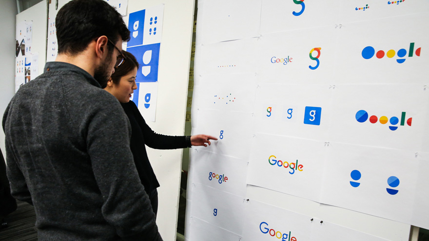
Image via Google Design
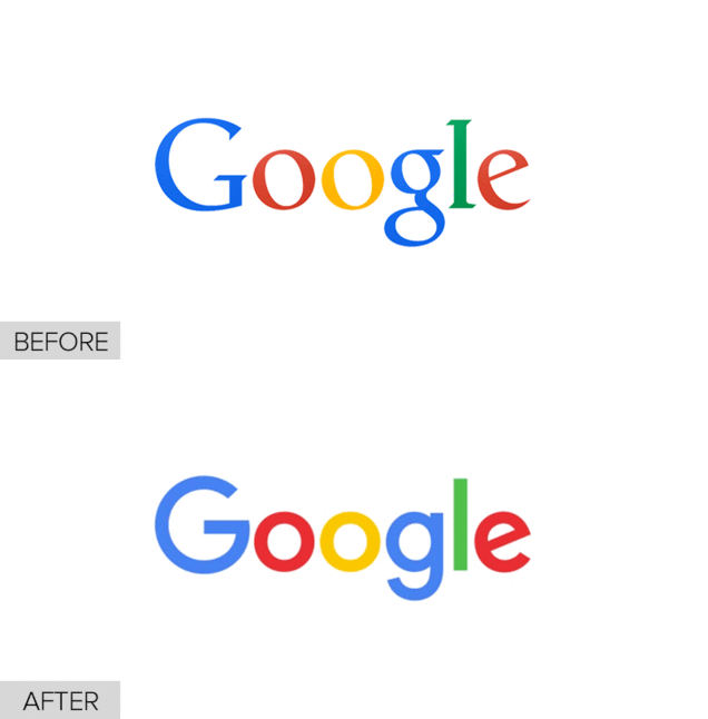
Google unveiled a new logo yesterday, and while it may seem like a mere cosmetic update, there’s actually very good reason why it made the change. It’s all to do with serifs – those tiny decorative lines at the edges of most letters. Serif fonts don’t scale well. Yes, they help with readability when there’s plenty of text, but shrink them and letters with similar shapes, such as “i’ and “l”, get mixed up.

Image via Gizmodo
The logo change will also benefit Internet users with low bandwidth. Previously, they wouldn’t be able to see an image version of the logo, but a text version that appeared largely similar.
The redesigned logo is generated using a vector-based file type called a Scalable Vector Graphic (SVG), effectively reducing the file size and letting slower Internet users have the same visual experience that those with faster connections enjoy.
The streamlined Google logo will be applied across all of the brand’s products, such as Google Maps and Google+. For an in-depth read on the elaborate thinking process behind Google’s new logo, visit the Google Design page.
Source: Gizmodo
TAGS
Tags:


