Sign up for trending news and first dibs
YouTube Sans, a Font Inspired by the Play Button
YouTube Sans, a Font Inspired by the Play Button
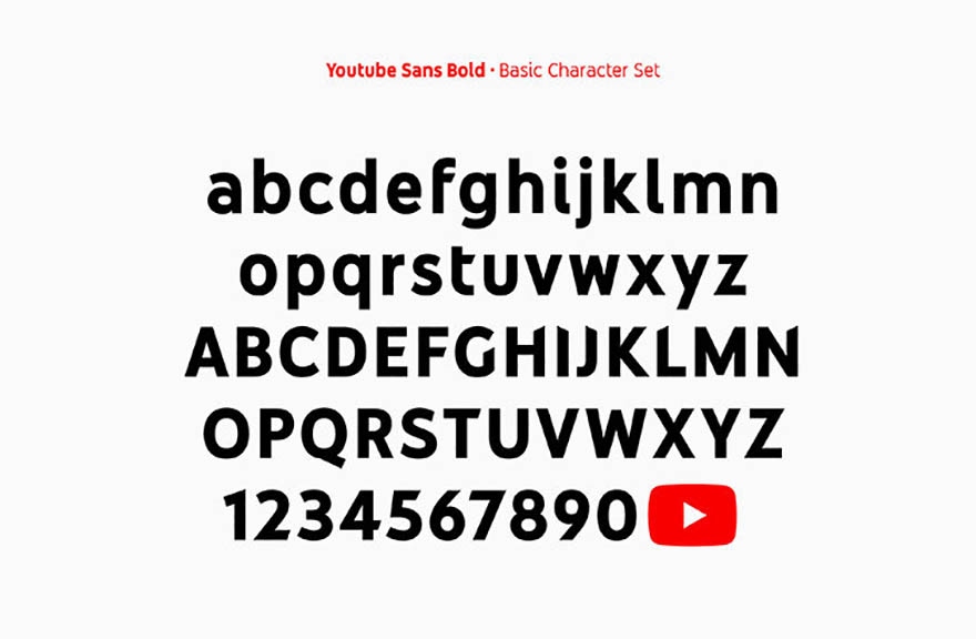
YouTube Sans, YouTube’s very own font, draws inspiration from the YouTube play button.

Photo: Saffron
YouTube Sans includes a play button glyph, so that the brand’s icon can be typed in as any other letter or symbol.
The typeface was designed by branding agency Saffron, in collaboration with Letterjuice, URW++ and YouTube’s in-house UX team. According to Saffron, one of the key tasks of the brief was to refine the play button icon, ensuring that its “curves and angles were perfect” before turning it into a glyph.
Once done, the creators of the font proceeded to the letterforms, which were inspired by the play button. They feature soft rounded curves to match the icon’s outer edges, with angled cuts into the ends. The YouTube Sans typeface comes in light, medium and bold weights.
Launched alongside YouTube TV, the typeface will be used across all product and marketing communications from now on.
According to Saffron, the font “is slightly quirky and expressive, but also simple and bold, just like the platform it calls home.”
Source: It’s Nice That
Read More: Siri’s Got Competition: Google Assistant Now Available on iPhones
TAGS
Tags:


